The MDX component set for Halentra's long-form content. Copy a block, fill in the content, keep the rhythm.
Default paragraph, bold and link styling, applied automatically to every MDX document through the shared Prose wrapper.
Body copy runs on a comfortable line height so long explanations stay easy to follow. Inline emphasis stays semantic and quiet, and a link looks like this one, styled through the shared text-link component rather than one-off inline styles.
Body copy runs as plain Markdown. Use **bold** for
semantic emphasis and [a link](/demo) for anything clickable.Two tones are wired up today: a soft mint box for general notes, and a dark panel for anything readers must not skim past.
Rates are set per user, per month. Devices sit on their own line so growth stays visible.
Never write “unlimited” into a contract. It is not a commercial term, it is a bet you lose on the worst possible week.
<Callout label="Note" tone="info">
  Rates are set per user, per month.
</Callout>

<Callout label="Heads up" tone="danger">
  Never write "unlimited" into a contract.
</Callout>labelstringtone"info" | "danger" | "question"default "info"childrenReactNode<Cta
title="Ready to see it on your own data?"
subtitle="30 minutes, no slides."
primaryLabel="Book a demo"
primaryHref="/demo"
secondaryLabel="See pricing"
secondaryHref="/solutions"
/>titlestringsubtitlestringprimaryLabelstringprimaryHrefstringsecondaryLabelstringsecondaryHrefstringThe secondary button only renders when both secondaryLabel and secondaryHref are set.
Renders full width by default, opens a full-screen lightbox on click, and preloads on hover so the transition feels instant.
<MediaImage
  src="/assets/hudu/hero.webp"
  alt="Example product screenshot"
  maxWidth={360}
/>srcstringaltstringmaxWidthnumberCaps the rendered width in px. Full width when unset.
A discount is a price change. An exception is a scope change. Confusing the two is how margins disappear quietly.
<PullQuote
  text="A discount is a price change."
  name="Marc Aubert"
  role="Halentra"
/>textstringnamestringrolestringWe stopped rebuilding quotes in a spreadsheet. Three tiers went into the PSA and renewals took half the time they used to.
<Quote
  text="We stopped rebuilding quotes in a spreadsheet."
  name="Sarah Lindqvist"
  role="Operations lead, Northbound IT"
/>textstringnamestringrolestring<DataTable
columns={["Tier", "Coverage", "What it includes"]}
rows={[
["Essential", "Business hours", "Patching, monitoring, service desk."],
]}
/>columnsstring[]widthsstring[]CSS grid track sizes, one per column. Defaults to an equal 1fr per column.
rowsReactNode[][]Yes. Every block below is a standalone MDX component, so an article can move from prose to a callout to a table without any special wiring.
Use the closest available block, or ask engineering to add it. The gaps section below tracks what the design calls for but the site doesn't render yet.
<Faq
  items={[
    { q: "Can I mix components?", a: "Yes, freely." },
  ]}
/>items{ q: string; a: string }[]<KeyNumbers
items={[
{ value: "12", label: "components live today" },
]}
/>items{ value: string; unit?: string; label: string }[]Plain prose first, blocks added only where they earn their place.
Callouts for asides, a table for anything tabular, a quote where it's earned.
The Prose wrapper keeps typography consistent across every collection.
<Timeline
  steps={[
    { period: "Step 1", title: "Write the draft", desc: "Plain prose first." },
  ]}
/>steps{ period: string; title: string; desc: string }[]Clients forgive increases. They do not forgive surprises.
<StatementBanner
  text="Clients forgive increases. They do not forgive surprises."
  accent="surprises"
/>textstringaccentstringMust be an exact substring of text. That substring is what gets the accent colour.
A responsive grid of thumbnails that opens into a full-screen gallery viewer with a resizable thumbnail rail, swipe/drag navigation, and keyboard support.
<Gallery
  images={[
    { src: "/assets/hudu/work-api.webp", alt: "API screenshot" },
    { src: "/assets/hudu/work-assist.webp", alt: "Assist screenshot" },
    { src: "/assets/hudu/work-screen-capture.webp", alt: "Screen capture" },
  ]}
  caption="Three shots side by side, one caption for the set."
/>images{ src: string; alt?: string }[]captionstringA two-column card: a green checkmarked list of what works well next to a plain list of what to watch out for.
<ProsCons
  works={{
    label: "Works well",
    items: ["Quotes leave the office in minutes."],
  }}
  watch={{
    label: "Watch out",
    items: ["Legacy contracts need a migration window."],
  }}
/>works{ label: string; items: string[] }watch{ label: string; items: string[] }A file card with an icon, title, and format/size subtitle, next to a pill button that downloads the attached document.
<Download
  label="Pricing model template"
  url="/api/media/files/cms-body/pricing-model-template.xlsx"
  fileName="pricing-model-template.xlsx"
  size="83968"
/>labelstringurlstringfileNamestringsizestringStringified byte count - the subtitle formats it into a human-readable size.
A row of labeled tabs; clicking a label swaps the single paragraph body shown below it.
A short summary of what this plan covers, in one paragraph.
<Tabs
  tabs={[
    { label: "Overview", body: "A short summary tab body goes here." },
    { label: "Pricing", body: "A second tab, swapped in on click." },
    { label: "Support", body: "A third tab, same paragraph treatment." },
  ]}
/>tabs{ label: string; body: string }[]A draggable image-comparison slider - drag the handle, or focus it and use the arrow keys, to reveal more of the after image.
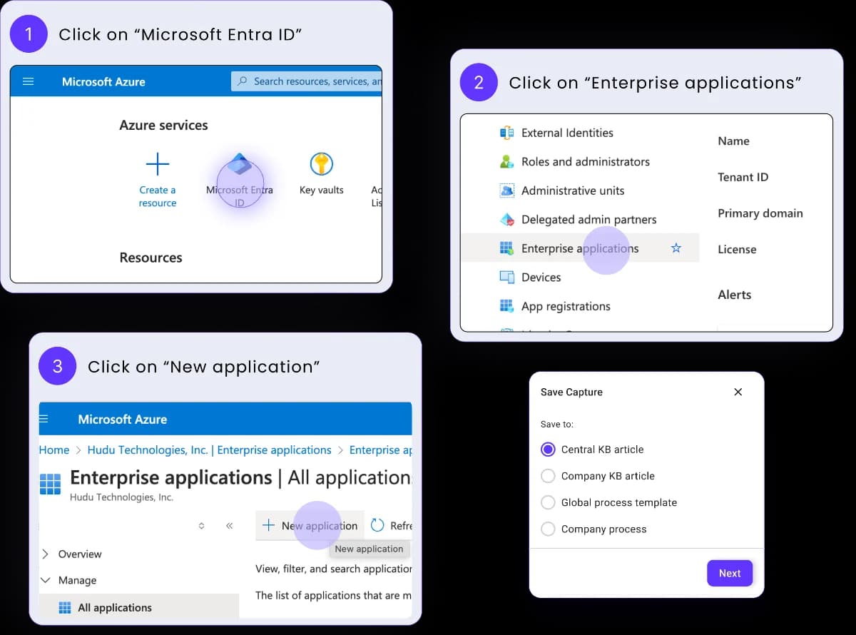
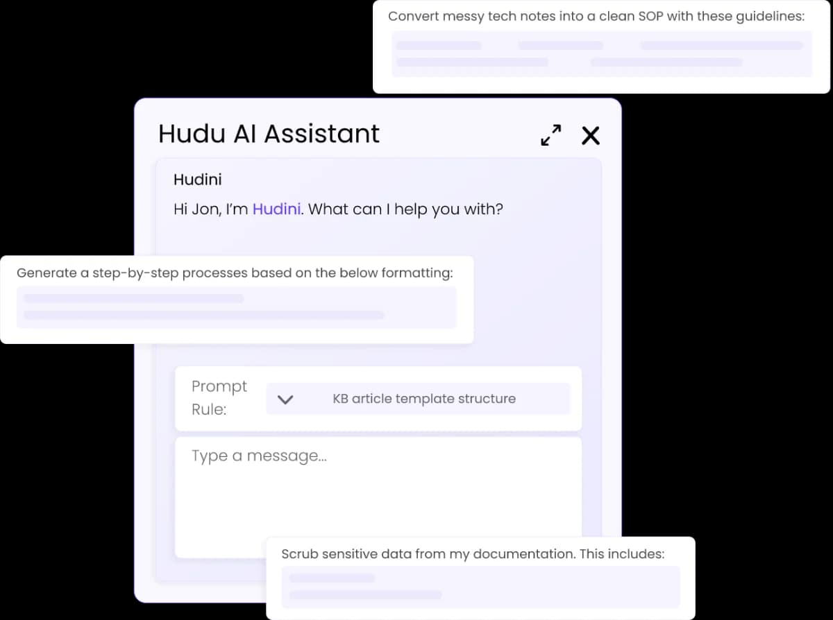
<BeforeAfter
  before="/assets/hudu/work-screen-capture.webp"
  after="/assets/hudu/work-hudini-ai.webp"
  beforeLabel="BEFORE"
  afterLabel="AFTER"
/>beforestringImage URL shown at split 0.
afterstringImage URL revealed as the split grows.
beforeLabelstringdefault "BEFORE"afterLabelstringdefault "AFTER"A compact dark banner pairing a circular avatar photo with a title/subtitle line and a bright pill CTA - drop it after a pricing or comparison section to route the reader to a named contact.
<AskExpert
  photo="/assets/testimonials/amerix-livio.png"
  title="Not sure where your contracts stand?"
  body="Send us your current price list. We will tell you what to keep."
  ctaLabel="Talk to us"
  ctaUrl="/contact"
/>photostringCircular avatar photo URL. Renders a bare placeholder circle when unset.
titlestringbodystringctaLabelstringctaUrlstringA two-competitor table with category group headers, five per-cell content types (checks, an "Advantage" pill, crosses, plain text, and a linked price), optional per-row info tooltips, and a footer CTA bar.
<FeatureComparison
  columns={[
    { name: "Hudu", subtitle: "Distributed by Halentra" },
    { name: "IT Glue", subtitle: "Alternative" },
  ]}
  groups={[
    {
      label: "Documentation",
      rows: [
        {
          feature: "IPAM",
          tooltip: "IP address management, built in.",
          cells: [{ kind: "check" }, { kind: "cross" }],
        },
      ],
    },
  ]}
  footerNote="Based on public pricing pages, checked June 2026."
  footerLinkLabel="Spotted something out of date?"
  footerLinkUrl="/contact"
  ctaLabel="Plan a migration"
  ctaUrl="/contact"
/>columns[{ name: string; subtitle: string; logo?: string }, { name: string; subtitle: string; logo?: string }]Exactly two entries. The first is the highlighted column - Halentra's own pick.
groups{ label: string; rows: { feature: string; tooltip?: string; cells: [Cell, Cell] }[] }[]Cell is one of { kind: "check" }, { kind: "check-advantage" }, { kind: "cross" }, { kind: "text"; text }, or { kind: "link"; text; href }.
footerNotestringfooterLinkLabelstringfooterLinkUrlstringThe inline footer link only renders when both footerLinkLabel and footerLinkUrl are set.
ctaLabelstringctaUrlstringThe design references these blocks too, but nothing renders them here yet. Flagging them so the gap is visible rather than silently missing.